How to Brand and Design a Blog You Love
Feeling overwhelmed with creating the branding for your blog & business? Our graphic designers are here to help with 7 steps to help you brand and design a blog you love!
If the thought of establishing a cohesive look for your blog or company makes you stress, then have no fear! In this post we are going to go over some important steps to consider when branding your blog, yourself, or even your business.
Branding is important for so many reasons, but many tend to struggle on where to even begin. Here we have listed some steps that we believe will get you on the right track! So, whether you’re already familiar with the branding/design world, or completely new to it, these steps should help you get started with creating the branding for your blog & business that you’ve always dreamed of.

Are you ready for one sentence to change your business?
Using the right hook can do just that!
The truth is, an Instagram reel won’t change your business, at least not all on its own. But if you’re using the power of Instagram to drive leads into your business, using the right hook is vital for your success. Grab the exact hooks that have gone viral for my @ruthsoukup Instagram account again and again (and got me over 30 MILLION views and tens of thousands of new followers).
And the best part? It’s completely free! Just fill in your information below so I know where to send it.
Hey there! Our names are Emma and Melissa, and we are the Graphic Designers for Ruth Soukup Omnimedia. We both graduated from Longwood University with a bachelor’s degree in Graphic Design with a focus of Brand Identity and Media. Over the past 6 years we have worked on countless projects dealing with branding, logo creation, color schemes, photo editing and much more. So we like to think we know a thing or two when it comes to graphic design.
We also understand that hiring a graphic designer or two is not always feasible when you’re first starting out a blog, so we have created these steps to get you started on creating branding for your blog! We hope these steps help you all feel more comfortable with being creative and building your blog’s branding!
Here are 7 steps that will help get you started creating a brand that you love:
STEP 1: KNOW YOUR AUDIENCE
This first step is CRUCIAL in moving forward with your brand. Knowing your audience is the stepping stone in deciding what you want the overall look and feel of your brand to be.
Take time to investigate your audience’s needs and what makes them tick. The more you know about your audience, the better you will be at keeping them engaged with your designs/branding. If you’re not 100% sure what resonates with your audience, we would suggest creating a few styles of graphics to test out what is grabbing their attention. Once you pin point that style, stick with it and keep your branding consistent!
STEP 2: CHOOSE A DESIGN PROGRAM TO USE
While we suggest learning Adobe Design programs such as InDesign, Illustrator and Photoshop, we understand these are expensive and can be hard to learn when you start to brand and design a blog. (it took us 4 years to learn them and we still wouldn’t call ourselves experts with all of the programs that Adobe offers!)
We suggest these Adobe programs because they give you the most freedom to do anything you need to make unlike many of the online resources that claim to be “graphic design tools”.
We do understand however that it’s much easier to use those online resources if you aren’t comfortable learning the Adobe Design programs so here are a few suggestions and articles with free online graphic design resources:
Canva
Vectr
Canva Alternatives
Forbes Online Design Tool
If you love a more user-friendly site like Canva, then don’t miss this step-by-step walk-through on how to create a Lead Magnet using Canva (perfect for non-designers!)
STEP 3: PICK A COLOR SCHEME
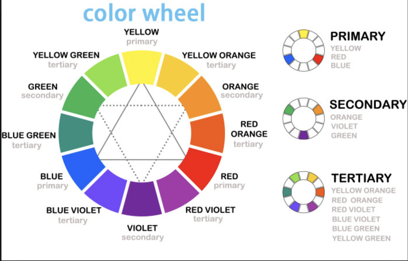
Colors play a very vital role when designing graphics. The primary colors are red, yellow, and blue. Secondary colors are green, purple, orange—which are formed by combining the primary colors. Tertiary colors are created when you mix a primary color with a secondary color, such as yellow-orange or blue-green. Cool colors are blue, purple, and green and warm colors are red, yellow and orange.
While this may seem elementary to review, it’s actually very important to consider when deciding what colors to use in your color scheme. We suggest looking into the art of Color Theory as a start to get yourself acquainted with the psychology of colors and what effects colors can have on an audience.
You may be surprised how much colors have an effect on people and how much it can influence the decisions of your viewers. Be sure to keep in mind your audience from Step 1 when picking a color scheme.
CLICK HERE TO GET OUR FREE PRINTABLE BRANDING AND DESIGN GUIDE
As a rule of thumb, you typically don’t want more than 4-5 different colors because it can get overwhelming. Instead, choose one or two signature colors, an accent color and a neutral color. Another helpful hint would be to just limit your color scheme to a simple 2-3 colors and use tints/shades of those colors (either darker or lighter versions of the colors) to keep the branding together. This way you can still have a variety of colors to use without it being too overwhelming.
If you’ve ever played around with color on any computer program, you’ve probably seen a module that listed RGB or CMYK colors with some numbers next to the letters.
Ever wondered what those letters mean?
CMYK is used when dealing with printing which stands for Cyan, Magenta, Yellow, Key (Black)
RGB is used for the web which stands for Red, Green, Blue
Once you are ready to establish a color scheme you’ll want to be sure the colors you chose match well with the message you are trying to convey and for your audience.
Here are some helpful sites to play around and see what colors work best together and creating color schemes:
STEP 4: IMPORTANT TYPEFACE LESSONS
It’s also important to know the different styles of typefaces and how they pair together. There are 3 main types of typefaces that are good to know:
1. Serif
The small features on the ends of strokes in some fonts are known as Serifs.
Common Serif Typefaces: Times New Roman, Georgia, Palatino and Garamond
2. Sans Serif
Sans Serif typefaces are the opposite of Serif typefaces, they do not have any extending features on the edges of the letter.
Common Sans Serif Typeface: Arial, Helvetica, Century Gothic and Tahoma
3. Script
Script typefaces based upon the varied and often fluid stroke created by
handwriting.
Here are some helpful resources for font pairing and about typography:
Pairing Fonts (Visme)
Font Pairing (Adobe InDesign)
Ultimate Guide to Font Pairing (Canva)
STEP 5 : FIND (GOOD QUALITY) PHOTOGRAPHY
If hiring a photographer to take your photos for your blog is not something you can afford or feel is necessary at the moment, we would suggest paying for a stock photo site membership.
Make sure you’ve vetted out the site before you make a commitment to pay for it. Not all stock photo sites are created equally! You don’t want to buy a membership and find out the quality of images are not good, that they don’t have a great variety or that the style of photographs won’t work for your blog’s style.
If paying for stock photos is not completely in your budget yet either, there are many great quality free stock photo sites. These sites will not give you as much variety and freedom as you would have hiring a photographer or buying the stock photo site membership, but they can offer some nice quality images until you are able to invest in better imagery.
Suggestions for paid stock photo sites:
STEP 6: FILE KNOWLEDGE
Knowing the differences between file types and what they are used for is important when it comes to graphics. You wouldn’t want to print something in a file type that is made for online-use only because then the quality of the print out would not be good. Here are the 3 basic file types you would need to know for your blog:
JPEG – Joint Photographic Experts Group
Common/Best Uses: website images / social media / photo sharing
PNG – Portable Network Graphics
When you see an image “free-floating” on a background, it’s likely to be a PNG. This is because PNG’s are the best file type when it comes to transparency. PNG files are formatted in such a way that the “transparent areas of the PNG will blend and adjust naturally to whatever is behind the image when the background of the page isn’t a solid white or black color.”
Common/Best Uses: website images on a background / product display images / logos
PDF – Portable Document Format
When it comes to the world of business, the PDF is perhaps the most prevalent of all file types. Its combination of versatility and compatibility make it a workhorse of information sharing.
Common/Best Uses: Workbooks / printables / any printed material
GET OUR FREE PRINTABLE BRANDING AND DESIGN GUIDE HERE
Another important thing to keep in mind when it comes to file saving is how to compress images. Compressing images is important because some platforms put a limit on the file size you can upload and also low quality images can come out blurry if their resolution isn’t high enough quality! Before we get into Compression it’s important to know the term Resolution.
The basic definition of Resolution is a measure used to describe the sharpness and clarity of an image or picture and is often used as a metric for judging the quality of monitors, printers, digital images and a various other hardware and software technologies. The general rule of thumb to remember is for internet use you want your image resolution to be 72 or above and for printing you want it to be 300 or above.
You want a higher resolution for printing because if you don’t have a higher resolution, the images and text will not be crisp and can look blurry! So now that you know a little about resolution we can talk about compression. Compression is just what it sounds like, you take a large file and compress it down to a smaller size. This is important to do for uploading to social media or blogs because a large file can slow down the speed of the page it’s on and can cause many headaches if you’re not aware of the file size!
STEP 7: CREATE A BRAND GUIDE
The last step we would suggest is important for your brand’s consistency. Once you’ve established a color scheme and typefaces you’d like to use in your branding, you should create a brand guide for your blog. Brand guides are just what they sound like, they have all the brand standards in one place for you to keep all your branding consistent.
They normally include the logo, colors in your brand, typefaces you use, and anything else you include in your branding. It’s good to keep it as a reference for yourself to stay consistent and if your business ever grows to include a team having a brand guide will help get all your employees on the same page with your brand.
While some of these steps may seem to be elementary, they are still super important when creating a brand and should not be overlooked! Knowing your audience will help move your branding in the right direction because it will connect with the people you’re trying to reach. Doing so will then begin to shape and mold the overall look of your blog.
Choosing and learning how to use the right programs will ultimately help ease the process when creating your products and graphics. It’s important to remember that colors are crucial to convey the right mood and feel for your blog and business. Choosing the wrong color could throw off how people view your brand and how they interact with your content.
Also, choosing the right typeface goes hand in hand with choosing the right color scheme. You want the fonts you use to properly reflect what you are trying to say. As for photography, the saying “a picture is worth a thousand words” really is true. You want to be sure that your content and imagery go together and support what you are trying to convey.
Most people don’t spend more than a few seconds looking at the graphic and if your design doesn’t draw them in, then you have lost a potential follower or customer!
Understanding how you are saving your work whether it be a blog graphic, a printable download, or an ebook is also imperative. Always keep resolution and compression in mind when uploading images or when printing from a PDF.
Finally, creating a brand guide is essential. It is almost like wrapping your brand up in a little bow that has everything you would need to know when referencing back to your blog or business.
Take each step one at a time and really focus on the end goal of what you are trying to accomplish and say with your brand.
Looking for a more basic overview on how to get started with your blog design? Don’t miss this post on how to design a blog that gets more readers!
If you liked this post, be sure to check out our printable branding and design guide. It’s free, but only for a limited time! GET IT HERE.




I try to click on the free branding and design guide but it says 404 not found. Is there a way I can still get it?
Ruth, inspiring article. I wish I read your article years ago. I still vividly remember the days I paid $100 for a not-so-great logo design. I could have designed it much better than that using Canva as you mentioned. However, after several years, I have been running a successful blog and co-founder of a successful company. I like the way you generously giving out information without expecting anything in return. I would love to interview for our new blog post titled Successful bloggers list. Please let me know if you could spare a few minutes? Thanks.
I am very impressed about your 7 steps about how to design and brand a blog you love. It is very informative.
I started practicing with canvas
Hi, this is Sabrina Brown, the editor of Longwood University’s alumni magazine. We’d love to do a short story about your graphic designers Emma and Melissa, who graduated from Longwood. Could you let me know how to get in touch with them? I’m leaving my email address. Or you could ask them to get get in touch with me by phone at my office, 434-395-2021. Thanks!