Rock Your Blog Post Graphics
There’s no doubt about it: the world we live in today is a visual one.
People have always been naturally drawn to visuals, but in the last few years, with social media platforms shifting their focus from text to images (think Instagram and Pinterest), visuals have never been more important to bloggers than they are today.
Why You Need Images in Your Blog Posts
In the early days of the ‘interwebs’, SEO was all about the finding the right keywords to drive traffic to your site. Images were an afterthought (if a thought at all!). Computers were slow and took what seemed like years to load a single image. The iPhone wasn’t even a blip on Steve Jobs’ radar. Remember those days?

Are you ready for one sentence to change your business?
Using the right hook can do just that!
The truth is, an Instagram reel won’t change your business, at least not all on its own. But if you’re using the power of Instagram to drive leads into your business, using the right hook is vital for your success. Grab the exact hooks that have gone viral for my @ruthsoukup Instagram account again and again (and got me over 30 MILLION views and tens of thousands of new followers).
And the best part? It’s completely free! Just fill in your information below so I know where to send it.
Well… times have changed!
The rise of social media turned the internet upside down and transformed it into a primarily visual space. I mean, just look at Pinterest! It is literally a visual search engine — the Google of all things visual — where users find what they’re looking for based on pictures, not text.
As technology has progressed at an astounding rate and computers (and smart phones) have gotten faster and faster, the image-centric internet that was completely out of the realm of possibility just a few short years ago is now something we practically take for granted. It’s the new norm.
And so, if we want our blogs to stand out from the text clutter and quickly connect with our readers, we need to take the visual impact into account. Now, of course, that doesn’t mean we don’t still want to write content that will knock our readers’ socks off–we do–but it’s also critical to pay attention to the images that promote that amazing content.
Images play a super important role in our blog posts. The right image can boost social media engagement and help you break through all the noise clogging your readers’ feeds. Since people have WAY shorter attention spans than they used to (shorter than a goldfish according to recent studies) using visuals within your posts increases engagement by breaking up large block of texts to refocus your readers and reinforce your content.
Not all images are created equal, though. We can’t just choose any image, slap it on our blog post, and expect to get results (how nice would that be?). Instead, we need to be strategic and create powerful images that catch and hold our readers’ attention.
But how, exactly, do you do that? Well, here are 3 tips for rocking your blog post graphics in order to grab your audience’s attention and hold their focus in your blog posts.
Tell the Story
First and foremost, images are storytelling devices. Readers should be able to look at the images in a blog post and get a sense of the story you are trying to tell.
I recently wrote a blog post on my “regular” blog, Living Well Spending Less, called Stop Boredom in Its Tracks about how to keep your kids busy and avoid the dreaded calls of “Moooooom! I’m bored!” In that post, my content team and I used five images:
- The featured image — a photo of a young boy playing with a model train set; and
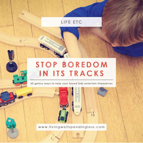
Four in-post images
- A photo of a brother and sister looking bored

- 2 photos of the “boredom jar” (a tool we suggest in the post to help parents stave off boredom)
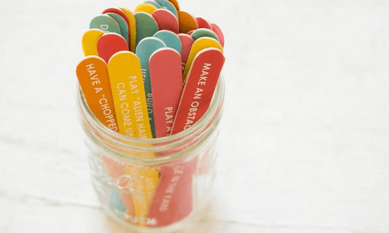
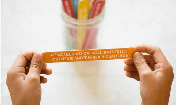
- 1 graphic of boredom jar printables
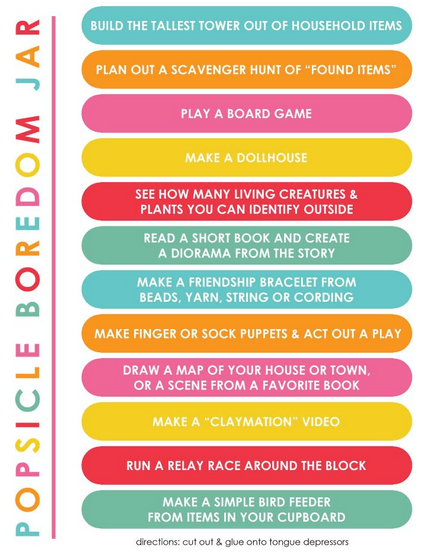
Each image was selected to move the article along and tell the story of the post.
It’s also a good idea to create your images AFTER you write your blog post. That way, you can look for moments within your post that need visual support.
Finally, look for images that match the tone of your post and blog — not just the content or keyword.
For example, we clearly needed an image of someone looking bored (the post IS about boredom), but didn’t want a stock photo of a bored businessman in an airport. Instead, we found one that a) featured children, and b) featured a bright background. This made it fit well with the tone, feel, and content of the post.
Don’t Forget About Text
If we want our images to drive traffic on social media platforms like Pinterest, we have to be strategic about it. If you compared the LWSL blog images from a few years ago to the images we use now, you’d notice a huge difference!
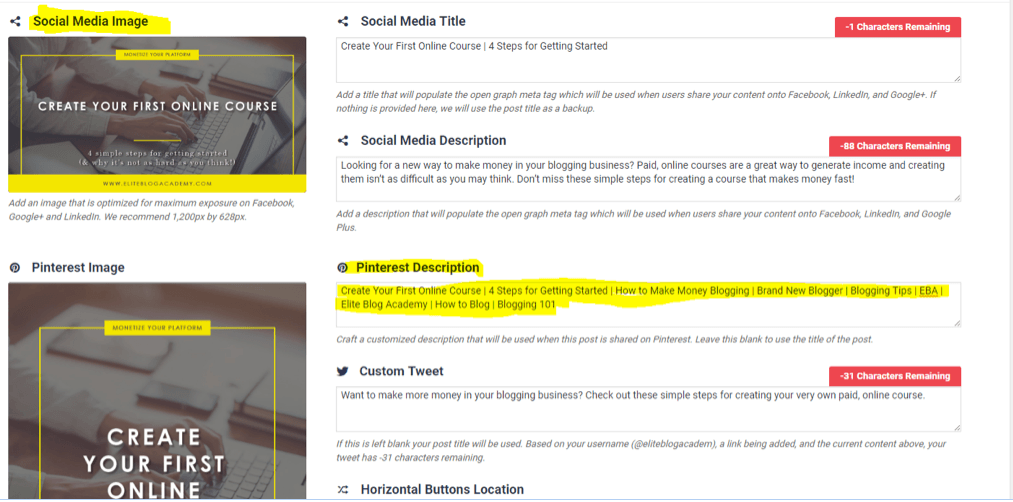
Through trial and error, we slowly discovered what works (and what bombs) for driving traffic through social media. One of the most important keys we learned was to include text on your images, and my team and I are constantly experimenting to see how we can improve the way our graphics are designed.
There’s only a narrow window of time to make an impression on social media. So if the audience isn’t 100% sure what the post is about or what value it can offer them when they first see the image, they’re likely to ignore it.
Using text, though, lets you include the title and possibly a subheading of your post. This paints a clearer picture of what they can expect when they click on your image.
Remember: we don’t want to write a novel on our images! When it comes to putting text on photos, keep it simple. Choose or create an image that represents your post, and then use a line or two of text to really drive the point home.
Keep It Consistent
Put yourself in your readers’ shoes and think about the insane amount of content they’re bombarded with on a daily basis. Their social media feeds are absolutely flooded with images and text coming from every angle. It’s totally overwhelming, and it’s super easy for your amazing content to get lost in the shuffle.
If we want to connect with our readers and make sure they never miss a post, we have to keep our images consistent.
When your images have the same look and feel to them, you’re actually building your brand. Over time, your audience becomes familiar with your brand, so when they see one of your images on social media, they’ll think, “Hey! I know her!”
That simple brand-recognition will help you break through the clutter and get on your audiences’ radar.
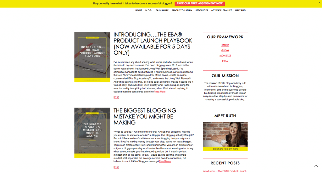
Consistent branding in our images has been super helpful at LWSL. We even created a template for our blog post images that cuts back on work for us. Now, all we have to do is make a few tweaks to the template and it’s good to publish. It also separates us from the pack and lets our readers easily recognize our posts.
Note: If you’re worried about boring your audience with the same kind of image post after post, don’t be! Will you get bored with it? Absolutely, but that doesn’t mean they will. Your audience is bombarded with content all day, every day, which can really overwhelm the senses. Keeping your images consistent is like giving your audience a break. It’s less work for them to process the image if it’s similar to something they’ve seen before.
The Bottom Line
We think these tips are super powerful, but it all boils down to one thing: know your audience. That pretty much goes for everything about your blog, but I just wanted to reinforce it one more time.
When creating your images, think about your audience’s taste, style, and personality and you’ll be fine!
Bonus Tips
- Bright colors typically work better than muted colors. Because they pop off the screen, they’re more likely to grab attention.
- Avoid using faces in images. they tend to make the image feel overly personal or difficult for the reader to connect it to the content.
- Get up close. Images should be clear, focused, and easy to see. If readers have to squint to see a person in the distance, the image won’t connect.
- Leave space for text. The extra clarity that text provides can help the image stand out from the rest
- Consistency is key. Create a template so all of your images have a similar look and feel, then switch out graphics, colors, and text to mix things up and keep it fresh.
Do you have any tips for creating awesome images to accompany blog posts? Leave them in the comments below!



Thank you! I’m completely self-taught when it comes to graphics and have fallen in love with PicMonkey and how user friendly it is. I’m struggling to define a template and a brand because I love so many styles! Working on it 🙂 Thanks for the great tips Ruth!
thank Ruth about Rock blog it is keeping planning
Such a great post! Thank you for sharing your knowledge!! This is one area I have been working on 🙂
Wow. Thanks for this article. I think this is really going to save me some time. I haven’t been the most consistent in branding, but I’m going to start with this.
What happen about this training net to much slow so Ruth looking to help us about that