Step-By-Step Guide to Creating a Lead Magnet in Canva (For Non-Designers)
Have you ever wondered how to create a lead magnet, but lack design expertise? Don’t miss this simple step-by-step guide to creating a lead magnet in Canva!
As bloggers, we wear SO many hats. From content creation and email marketing to social media strategy and monetization. It’s impossible to be an expert on any and everything! But there’s always one thing people come to me for help with, graphic design.
DIY vs. Outsourcing?
I am a firm believer that it is totally possible to become a successful blogger. Regardless of your design ability, you can create graphics that jump off the screen and digital products that generate recurring revenue. One of the ways I grow my email list is through lead magnets. Lead magnets are amazing, but they do require some design, but it doesn’t have to be a source of frustration or require a huge time and financial investment on your part. You don’t even need to outsource or try to learn fancy programs.

Are you ready for one sentence to change your business?
Using the right hook can do just that!
The truth is, an Instagram reel won’t change your business, at least not all on its own. But if you’re using the power of Instagram to drive leads into your business, using the right hook is vital for your success. Grab the exact hooks that have gone viral for my @ruthsoukup Instagram account again and again (and got me over 30 MILLION views and tens of thousands of new followers).
And the best part? It’s completely free! Just fill in your information below so I know where to send it.
I’m going to walk you through, step-by-step exactly what you need to get you well on your way to creating a lead magnet in Canva!
Creating a Lead Magnet in Canva (for Non-Designers)
For those that aren’t familiar with Canva, it is a free online design platform that is geared towards bloggers and online business owners. It’s extremely easy to use and I’ve personally created on Canva, a ton of social media graphics, eBooks, checklists, workbooks, planners, slide decks for online courses, and the list goes on. However, creating a lead magnet in Canva doesn’t have to be complicated! We’ll walk you through what can actually be a fairly quick and painless process! Ready?
Let’s get started.
Why do you need to take the time to design your lead magnet?
We all know we need lead magnets. They’re the best and fastest, way to grow your email list! But many bloggers struggle with designing them.
Why you need to take the time to create professional, eye-catching lead magnets:
- Higher conversions– If your lead magnet is attractive and jumps off the page, you will convert readers to subscribers at a significantly higher rate.
- Usability– if your lead magnet is neat and organized then your subscriber will have an easier time using it to its fullest potential, resulting in better results for your reader.
- Credibility– a professional appearance goes a long way when it comes to establishing yourself as a true business and gaining trust with your readers.
Once you’ve determined what type of lead magnet you want to create, it’s time to bring it to life.
STEP ONE: Getting Started
For this walk-through, I’m going to be creating a lead magnet in Canva known as a Worksheet. Worksheets are a fantastic way to turn your blog post into actionable content for your reader. Let’s say, for this tutorial, the blog post I’m going to use the lead magnet on is titled: 15 Ways to Reduce Your Monthly Spending.
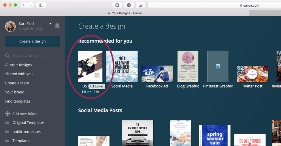
First, let’s open Canva and choose a simple US Letter size.
This will open up your blank canvas. Before we really get into actually designing the lead magnet, I want to make sure you are familiar with Canva and some of the tools you will need to use.
Items to add to your Lead Magnet:
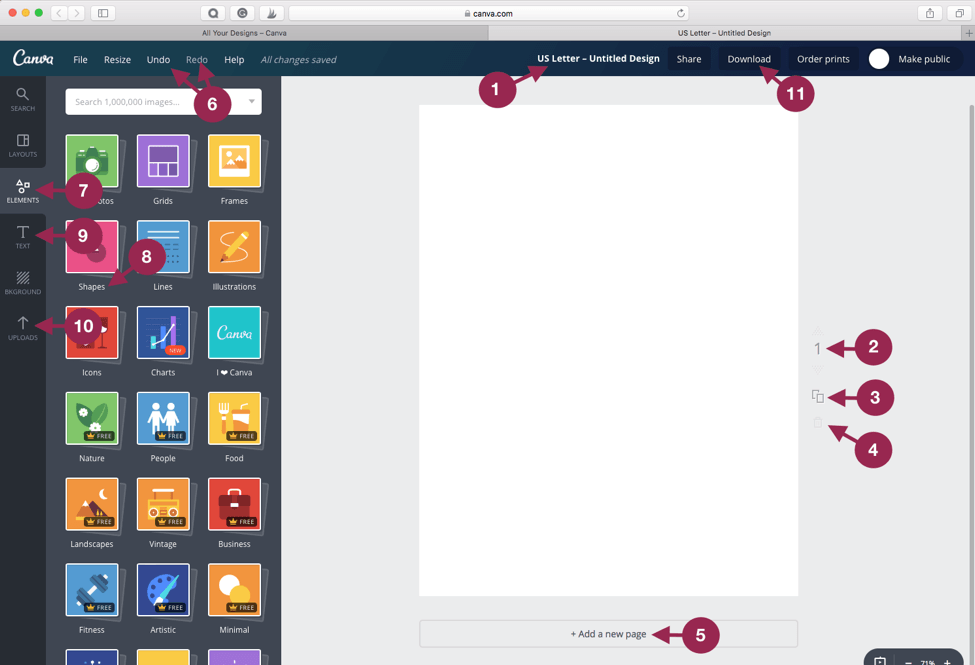
Project title
You can change it to whatever you’d like. I recommend keeping it simple and using the same title of your blog post with the type of freebie and your blog name. So for this example, I’d use: 15 Ways to Reduce Monthly Spending Worksheet by Blog Name
Page number
Once you have several pages, you will notice arrows above and below the page number that you can use to rearrange the pages.
Duplicate button
Clicking this will add a new page to your document that is an exact duplicate. I use this option sometimes when I want to keep the general layout of a page I’ve already created and then I just change up the content.
Delete page
This is hard to see in the screenshot above, but it looks like a little trash can. This will delete a specific page.
Add a new page
This will add a new blank page to your document.
Redo and undo
These options will let you go back if you’ve made a mistake or redo an action that you didn’t mean to do. You can undo as many times as you’d like.
Elements
Here you will find shapes, grids, and other options like clip-art and design elements.
Shapes
These are frequently the only things (aside from text) that I use when creating lead magnets.
Text
This is where you will add your text. If you are using the paid version of Canva you can go to your Canva home screen and click on “my brand” to upload your own fonts. Otherwise, Canva provides many standard font options.
Uploads
This is where you can upload your own pictures and clip-art.
Download
Once you finish your design, you will click this button and select your desired file format and it will download to your computer for you to use.
Issues in Canva:
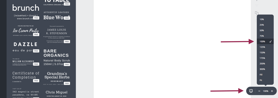
Another thing to be aware of in Canva is that you will want your project to be zoomed in at 100%. This is important because if your project isn’t zoomed in at 100%, the contents of the design will not be lined up correctly once downloaded. This is a glitch in Canva, the elements will appear lined up on the screen but once you download the design, they will be misaligned.
Now that you are familiar with Canva and the tools you’ll need to create your lead magnet, let’s start designing!
STEP TWO: Create the header
For a simple lead magnet, you don’t need to create a full cover page, just create a clean header. You can do this by using the shape tool and choosing the solid square shape. Then, size it to fit the top section of your lead magnet.
Next, add your title. Use simple font design techniques like pairing a script with a sans-serif font or overlapping fonts to create a drop shadow to help your title stand out. Here are examples of both:
STEP THREE: Skip the background.
I never use a pattern background on my lead magnets. Mainly, because it’s not printer-friendly. It simply uses a lot of ink, even if the person printed it in black and white.
The second reason is it’s too busy. Even if it’s a nice pattern, the overall feel of the design will be cluttered. White space is your friend and will give you more of that professional appearance you want for your designs.
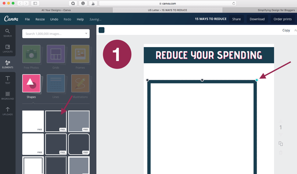
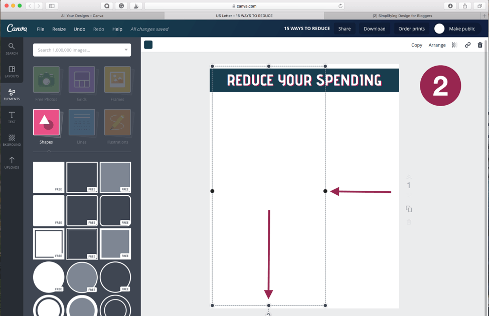
Something I commonly use instead of a background is a simple, thin-lined border. You can achieve this in Canva by choosing the outlined square shape.
The trick to this is that you will want to use the corner to adjust the size down until the outline is your desired thickness, then use the side adjustments to increase the size of the border until it fits the page.
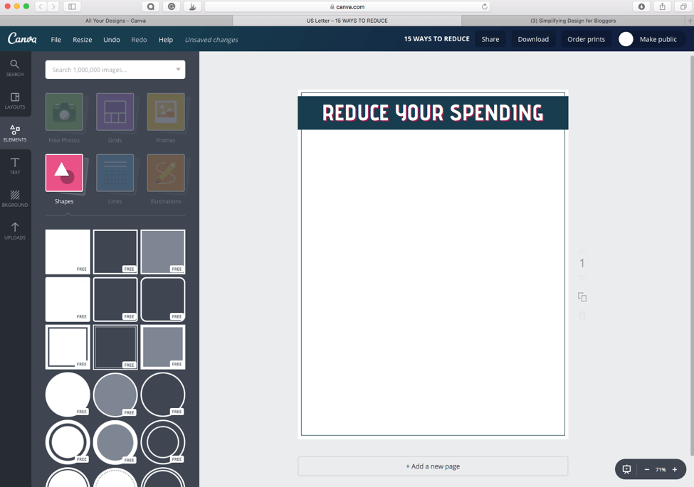
As you can see in the last screenshot, adding a thin border provides a little extra design element to your lead magnet without making it seem cluttered or busy.
STEP FOUR: Add your content
I use two tools in Canva for this:
1. The text tool
2. The shape tool
Depending on your content, you may just need a question-and-answer layout. Other times you may want to add checkboxes or other elements to your worksheet. These can all be created very simply using the text and shape tools.
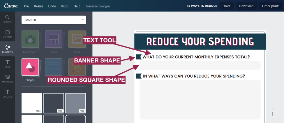
If you want a question and answer style, you can do something like this:
For this style, I first searched “banner” for the banner shape. You can find it in the shape section, but it’s faster to search for it. Then, I added the text and included the rounded square to create the section that will be filled in by the person using the worksheet.
You can also achieve more advanced styles using the same tools. For example:
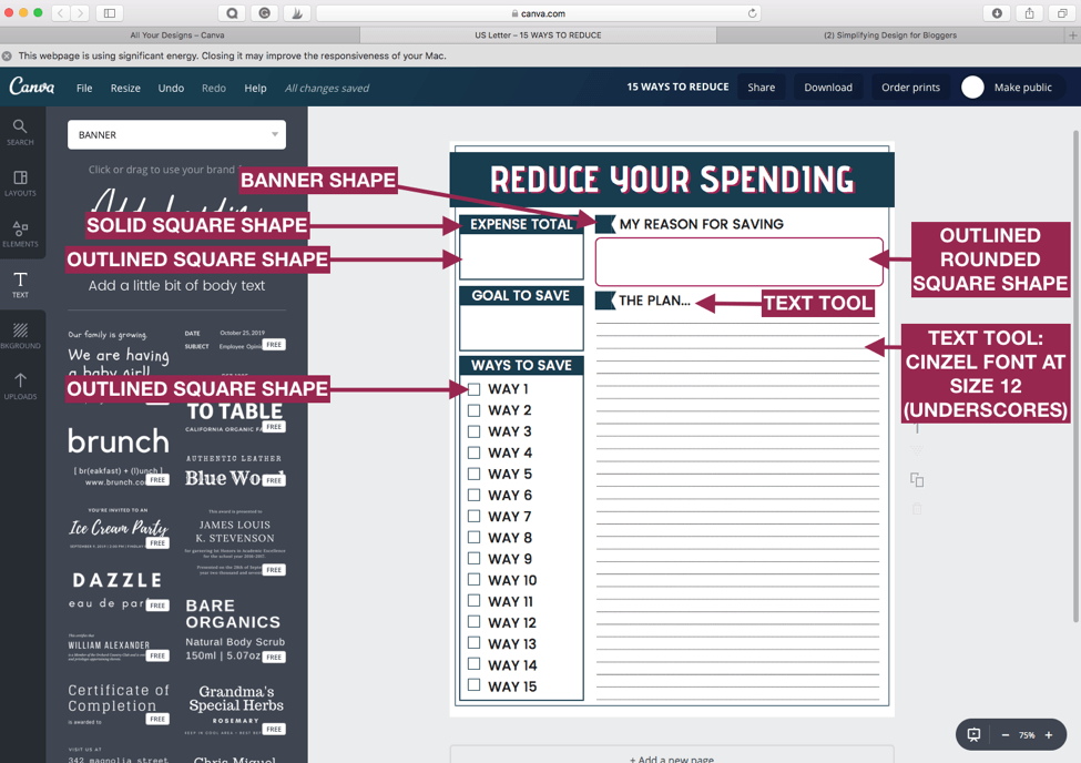
For this design, I used a few more shapes. I used the solid square shape to create a header section for the boxes. I used the squares to create checkboxes, and I also used the text tool in a creative way to create lines.
The trick to creating lines is underscoring with the Cinzel font (which comes standard on Canva). The underscores will be smooth, unlike other fonts that create a dotted-line appearance.
Finally, when planning out your layout, you may find it helpful to map it out on paper first. Refer to your post, decide what you want to include and then draw it on a piece of paper so you can see how everything will fit.
STEP FIVE: Add your copyright information
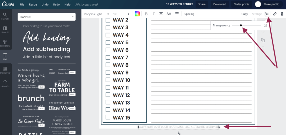
The last thing I do for every lead magnet includes copyright information. This is generally a simple line of text that reads something along the lines of “Copyright [year] [Blog name or LLC]. All Rights Reserved.” Sometimes, I use the transparency tool to turn down the brightness of the text so that it remains readable but doesn’t take away from the design or content.
Design doesn’t have to be a source of frustration.
In five simple steps, using two different tools in Canva, we were able to create a lead magnet in just minutes. Creating a lead magnet in Canva does not have to be a source of frustration or something that takes a massive amount of time to create!
Simply start with your header, use white-space to your advantage, add your content, and seal it off with your copyright info. Then, start using it to grow that list!
You may think that you lack creativity, but I promise you don’t! You have exactly what it takes to rock design for your blog, you may just need the right tools and a little direction.
This guest post was contributed by Kara Fidd.
Need more help designing your blog? Good branding and blog design are critical to a blogger’s success. Find out how to brand and design your blog so that you tell your audience exactly WHO you are as an entrepreneur and a company! It’s a game-changer, and right now you can get it absolutely free. GET IT HERE
Kara is a certified graphic designer committed to helping bloggers grow their businesses through graphic design. She believes you are capable of creating brilliant, jump-off-the-screen graphics to get you and your blog noticed and has dedicated her business to providing you the tools and direction you need to master design. Simplifying DIY Design is here to help you create those graphics that will give your blog more impact and more growth. Connect with Kara on Simplifying DIY Design. Get access to Kara’s free design library for done-for-you Canva templates, exclusive tutorials, and design tools!







This is a good tutorial, I just wish I could understand how to use the lead magnets in the website.
Such a great post Kara!! I created a worksheet along with your tutorial, which was lots of fun! I admit to being a Canva addict, yet your post helped me to figure out how to get my outline shape skinny!! I’m so excited! I think I have accidentally made it skinner but didn’t realize there is a ‘method to the madness’…I can’t wait to play with Canva and work on some lead magnets!
Thanks for this inspirational Guide
This should set you on the right tutorial if you decide to create lead magnet through Canva.
Do you offer one on one coaching?
I’m looking to expand my influence with idealhoroscope.com
Thank too